
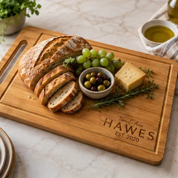
Classic Last Name
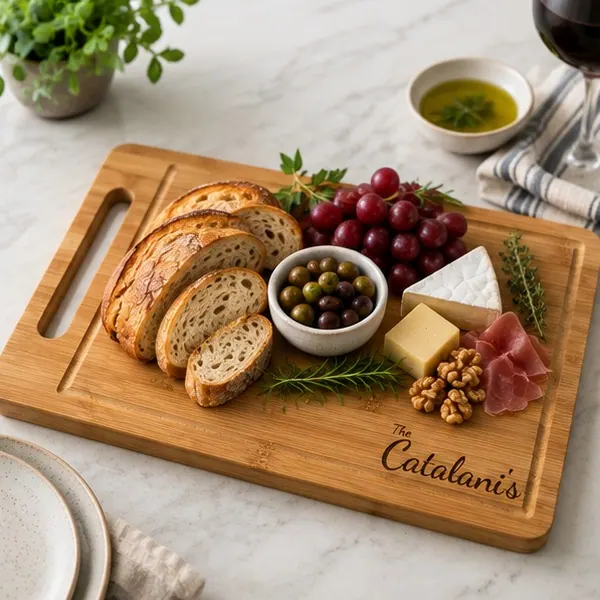
First names, last name and an optional EST year in the most versatile layout on the site.
$32.99–$39.99
Home › Guides › How to Choose the Right Engraved Cutting Board Design for Your Kitchen
6 min readChoosing by the room rather than the occasion. Which wood and lettering suit a modern kitchen, a farmhouse, a small apartment and an all-white room.
If you want the answer before the reasoning: acacia with a split monogram. It is the combination that looks intentional in the widest range of rooms, and it is the right default whenever you have not stood in the kitchen the board is going to.
This guide answers one axis of the decision: the room. If what you are unsure about is the occasion rather than the kitchen, the occasion-based guide answers that one, and it arrives at a different default for good reasons.
The reason the room matters at all is that a board which does not suit the kitchen it lives in ends up in a cupboard, and a board in a cupboard is not a gift.
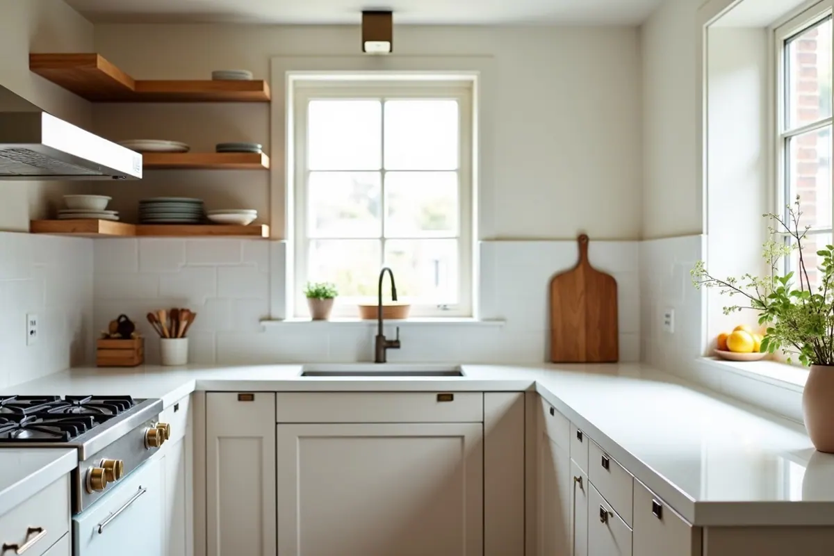
The wood is the larger visual decision. It is most of the surface area and it is what the eye reads first from across a room.
Bamboo is pale, even and cool-toned, with a fine parallel figure rather than wandering grain. It sits comfortably in kitchens that are already busy or already warm, because it adds light without adding another texture.
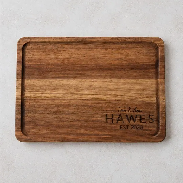
Acacia is a hardwood with genuine grain movement, from honey through to chocolate, often within one board. It brings warmth and visual interest, which is exactly what you want in a cool room and exactly what you do not want in a room already full of timber.
Neither is a large object. Bamboo is 12in x 7.8in x 0.5in; acacia is 12in x 8in x 0.6in. Leaned against a backsplash, either takes up about a foot of counter and stands eight inches high, which is roughly the footprint of a small picture frame. That is worth knowing before you plan it into a kitchen with no spare surface.
| Kitchen style | Wood | Lettering | Why |
|---|---|---|---|
| Modern and minimal. Flat-fronted cabinets, handleless doors, quartz or composite worktops, monochrome | Bamboo | Block capitals: the classic last name | The pale, even surface reads as deliberate rather than rustic, and straight lettering matches the geometry of the room. Script fights a minimal kitchen |
| Farmhouse and traditional. Shaker doors, butcher block or wood tones, open shelving, visible texture | Acacia | Script or the split monogram | The grain belongs in a room that already has wood in it, and softer letterforms speak the same language as the doors |
| Warm contemporary. Painted cabinets in a warm neutral, some wood, some stone | Either | Split monogram | The middle ground most kitchens actually occupy. The monogram's formality reads as intentional in a room that is neither stark nor rustic |
| Small kitchens and apartments. Nowhere to store it, so it lives out permanently | Acacia | Anything, kept short | The board is effectively furniture. Choose what you would happily put on a shelf, and keep the engraving to few enough characters that it does not shout in a small space |
| All-white or all-gray. No timber anywhere in the room | Acacia | Either | With no wood to compete with, the board becomes the warm accent. Better than a pale board disappearing into a pale room |
The lettering decision is smaller but it follows the same logic.
| Kitchen has | Lettering that suits it |
|---|---|
| Straight lines, flat surfaces, little pattern | Block capitals: the classic last name |
| Pattern, tile, soft shapes, color | Script |
| A mix, or you are unsure | The split monogram |
The rule underneath that table: match the lettering's formality to the room's formality. A script board in a stark modern kitchen looks like it was bought for somewhere else. Block capitals in a heavily patterned farmhouse kitchen look severe.
This changes the answer more than people expect.
On a wall or a rail. The board is decor. Prioritize how it looks: acacia and the split monogram photograph well and hold attention from a distance. The bamboo board has an integrated handle, which is the only one of the two that hangs without a hook through it.
Leaning on a worktop. Semi-permanent display. Choose for the room as above. This is the standard case.
In a drawer, brought out to serve. You have more freedom, because it is not competing with the room. Choose by the name and the occasion instead, and see the monogram versus last name comparison.
Used daily for prep. Take the bamboo, for the handle. On a board that gets lifted, carried to a sink and turned over several times a week, a defined place to grip is worth more day to day than grain figure is.
You probably have not seen it properly, and you should not pretend otherwise.
The safe play is acacia with the split monogram. It is the combination that looks intentional in the widest range of rooms, and it does not commit to a style opinion the way script does.
The unsafe play is trying to match a room you saw once. If you are genuinely unsure, choose for the object rather than the room. A good board in a good wood is never wrong, and a mismatched attempt at coordination is visibly an attempt.
Start with the wood, since it is most of what you see. Bamboo is pale and uniform and suits modern, minimal or already-warm kitchens. Acacia has grain movement and warmth, which suits cool, white or gray rooms where it becomes the accent. Then match the lettering's formality to the room's: block capitals for clean lines, script for pattern and softer shapes.
Bamboo, generally. Its pale, even surface reads as deliberate in a minimal room, where acacia's grain can look rustic against flat-fronted cabinets and composite worktops. The exception is an all-white or all-gray kitchen with no timber at all, where acacia supplies the warmth the room is missing.
Script or a split monogram on acacia. Both have softer shapes that match the language of shaker doors, open shelving and visible texture, and acacia's grain belongs in a room that already has wood in it. Block capitals can read as severe in that setting.
No, and trying to match exactly usually looks worse than a deliberate contrast. Wood tones rarely match precisely, and a near-match reads as a failed attempt where a clear difference reads as a choice. Pick the board that suits the room's temperature rather than its exact species.
Bamboo is 12in x 7.8in x 0.5in and acacia is 12in x 8in x 0.6in, so either occupies about a foot of counter lying down, or about a foot wide and eight inches high leaned against a backsplash. In a small kitchen that is worth checking before it becomes a permanent object in the room.
Acacia with a split monogram. It looks intentional in the widest range of rooms and avoids committing to a style opinion, and guessing at a color scheme you saw once is the thing that goes wrong. Note that this answers the room question specifically. If what you are unsure about is the occasion, the occasion guide recommends the classic last name instead, because a different uncertainty has a different safest answer.
Each product page previews your text on the actual wood, which answers the lettering question faster than reasoning does. See all three designs in both woods, or read the full bamboo and acacia comparison if the wood decision is the one holding you up.
First names, last name and an optional EST year in the most versatile layout on the site.
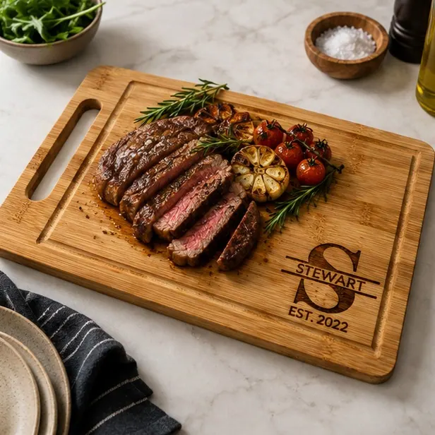
A timeless split layout with your initial, last name and optional EST year.
Soft script styling with an heirloom feel, especially strong for wedding gifting.
A butcher block is a thick end-grain or edge-grain surface that mostly stays put. A cutting board is a tool yo
Personalized means something gets made after you order, so it is not a same-day category. Here is the real tim
What to give parents who say they want nothing, how to split one gift between siblings, and what to engrave wh